Candler School
of Theology
Visual Identity. Collateral & Advertising Materials
Role: Second Designer, along side Brianna Nieman & Art Director by Sabrina Pfautz
The Brief
Emory University’s Candler School of Theology was looking for a new visual identity around their existing logo.
The Goal
With a current visual identity that blended in with the rest of the academic landscape, the brand wasn’t distinguished enough. We set out to create a brand that balanced their serious academic focus with the warmth of their community and bringing together the ideas of “gaining a greater understanding” and “making change”.
The Outcome
We created a system to last the Candler School decades into the future with a new set of custom patterns, graphics, typefaces, and color scheme. Then we were ready to launch the brand into the world.
Developing the Brand
I began my research with understanding the existing Workaway brand - their current challenges, their competition, and how to make them stand out. I brainstormed a free-form word association list to first depict the essence of brand, and picked out the words that could come to life visually. Next, I began
free-hand sketching, bringing my most successful marks into the vector phase. Playing with refreshing their existing horizon mark, full wordmarks, and intricate symbols. After iteration and iteration, pulling and pushing my ideas, I can come up with three distinct concepts to present to the client.

Campaign Work
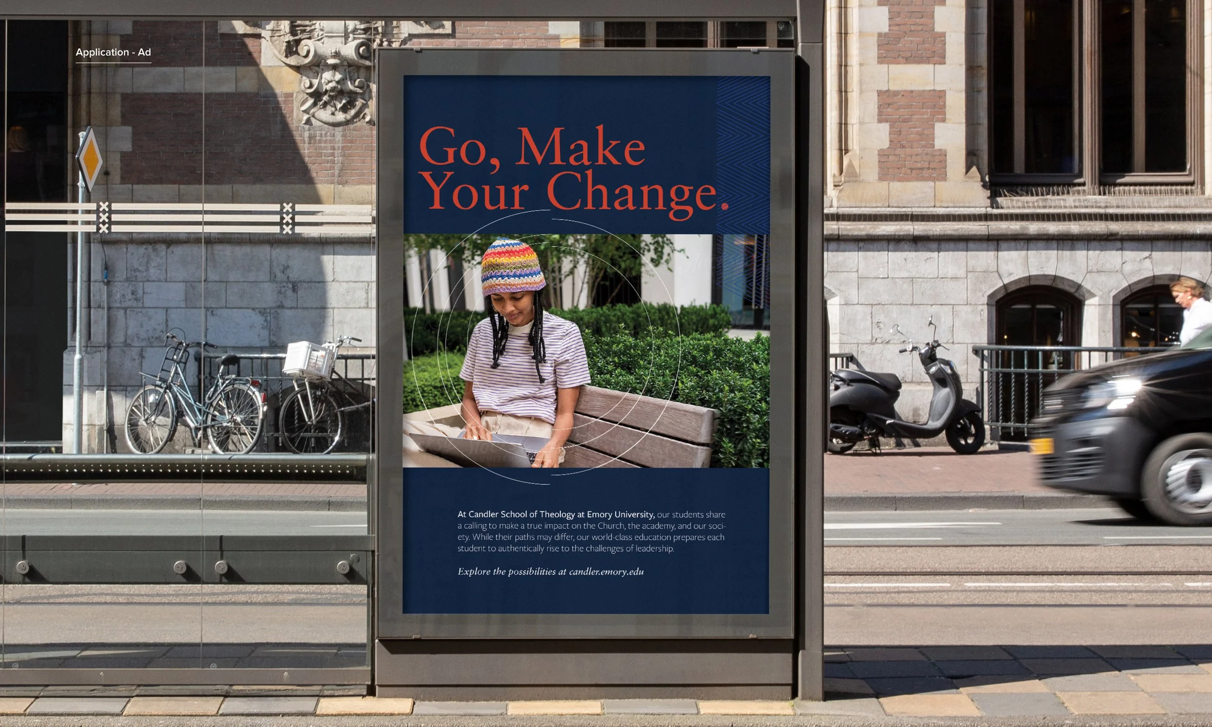
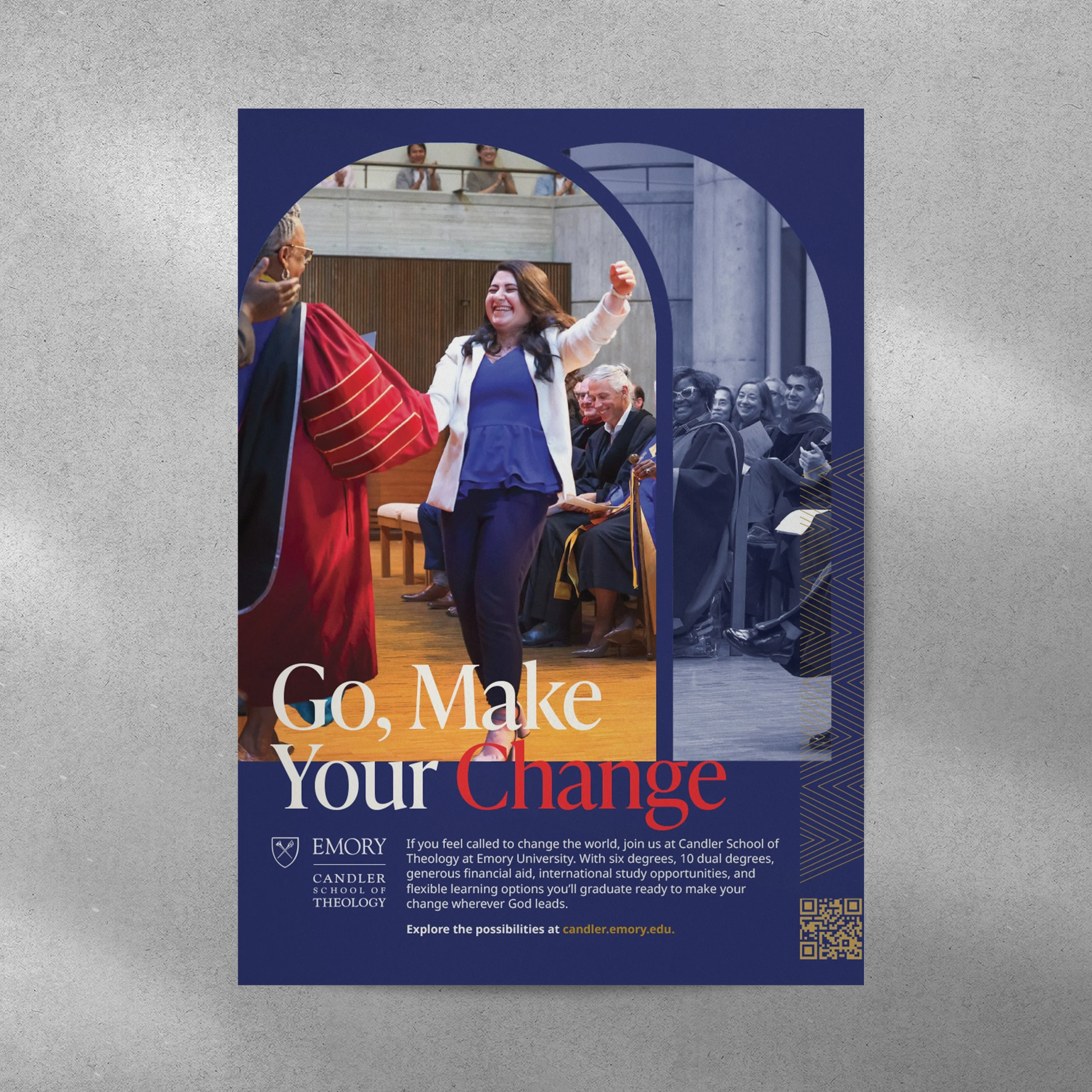
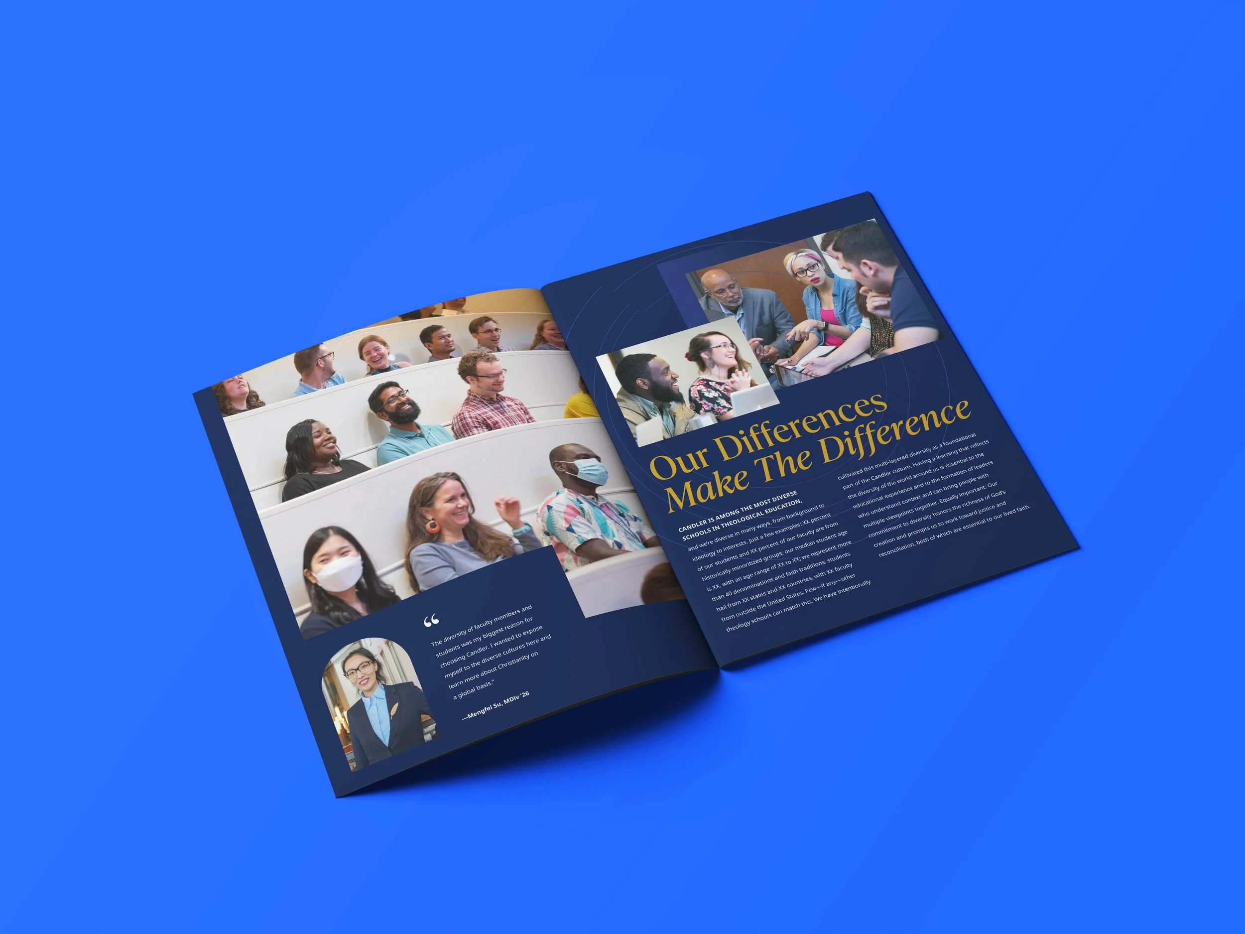
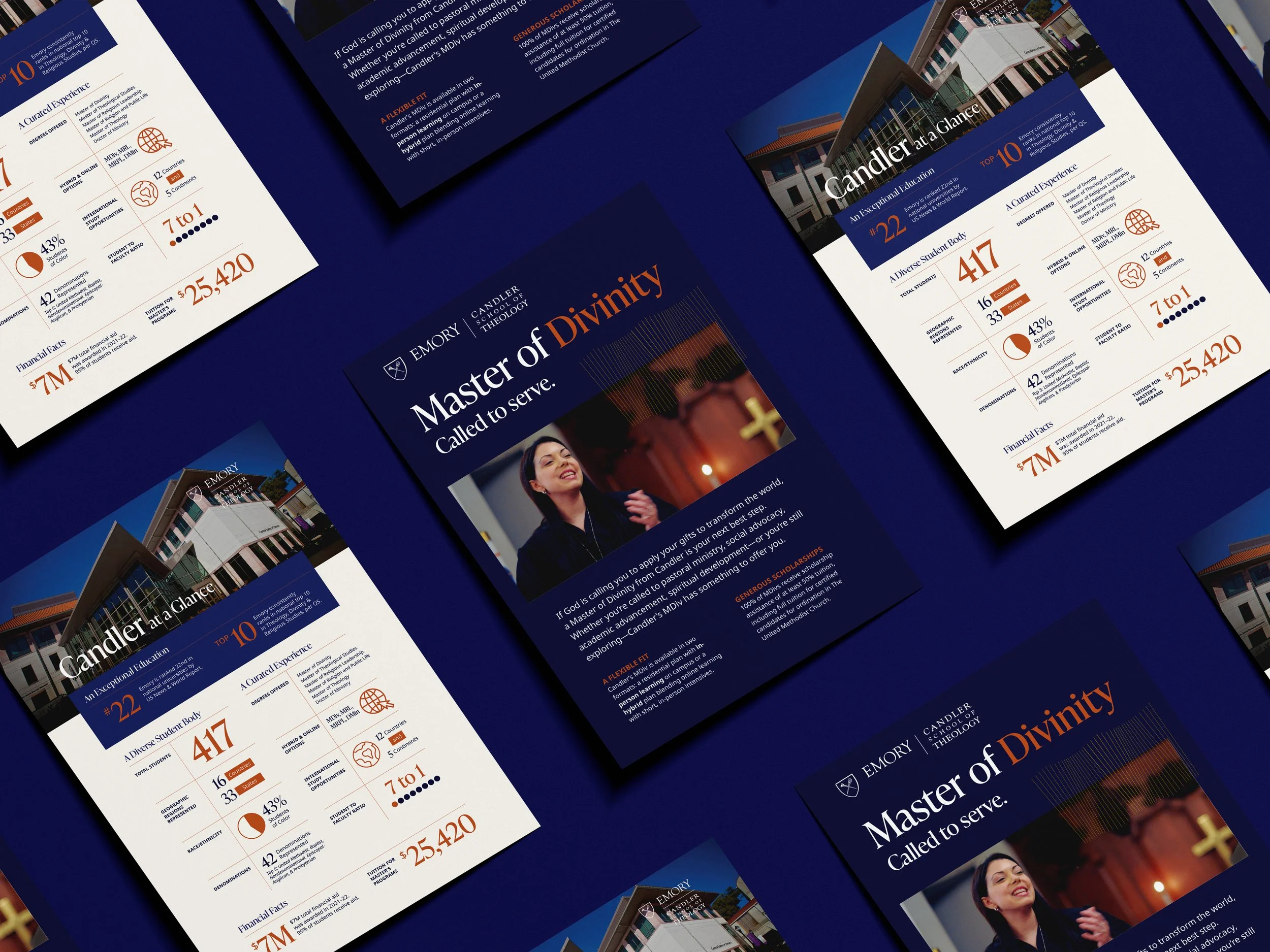
In addition to the brand, came a website launch and brand materials that we’re needed for the new school year - print and digital ads, admissions, at-a-glance, and MDiv Masters programs posters, as well as a university viewbook.

