Workaway
Logo Design. Visual Identity. Brand Guide
Role: Sole Designer and Art Director
The Brief
As a part of my Push10 internship, I implemented a re-brand for the company, Workaway, a network for matching hosts with travelers, to both work and experience life abroad.
The Goal
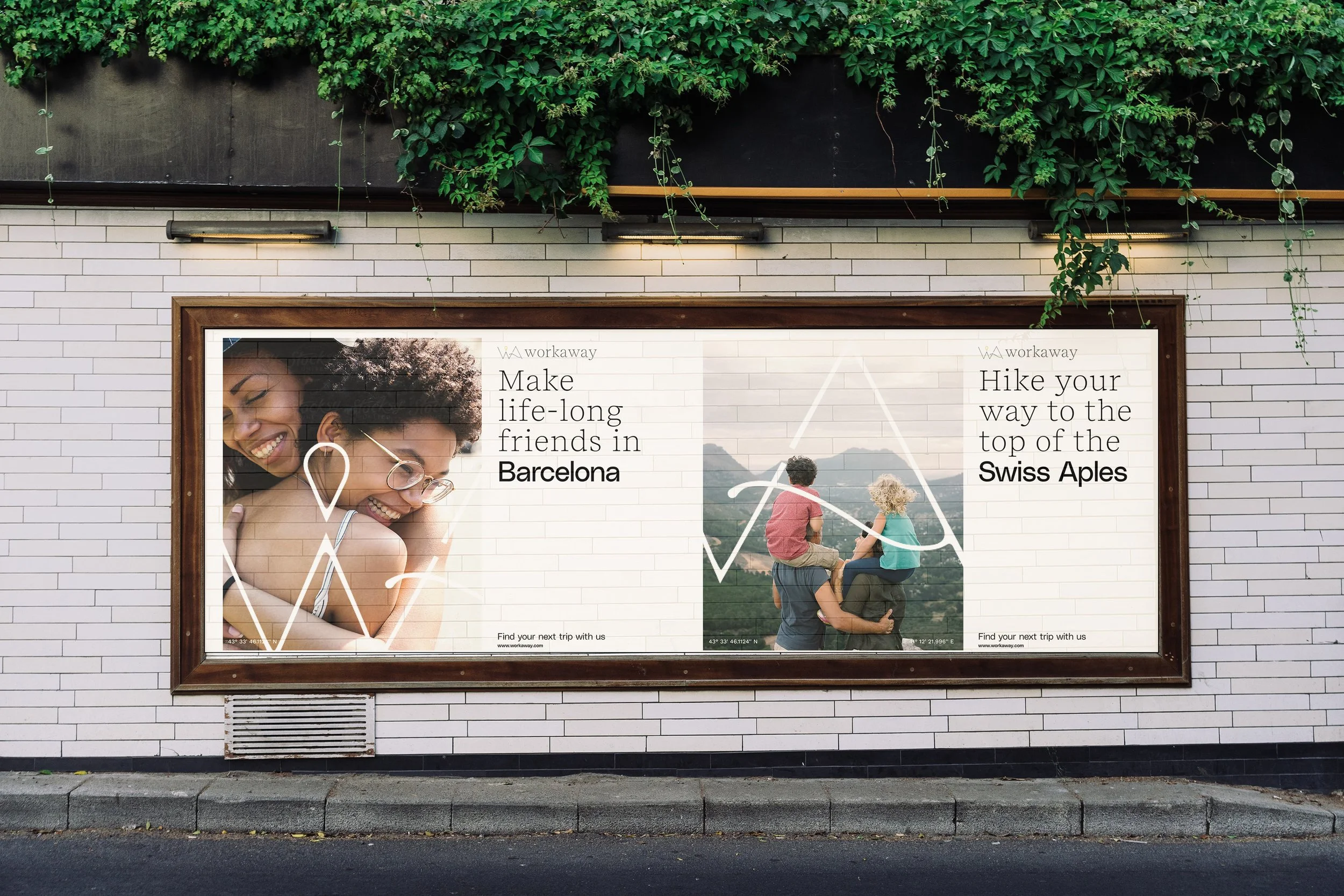
The goal was to focus on targeting families to further expand their audiences and develop a new logo that was the perfect blend of travel agency meets travel experience.
The Outcome
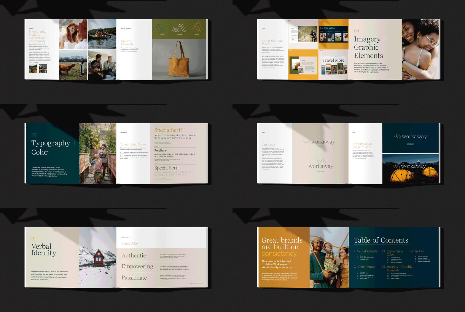
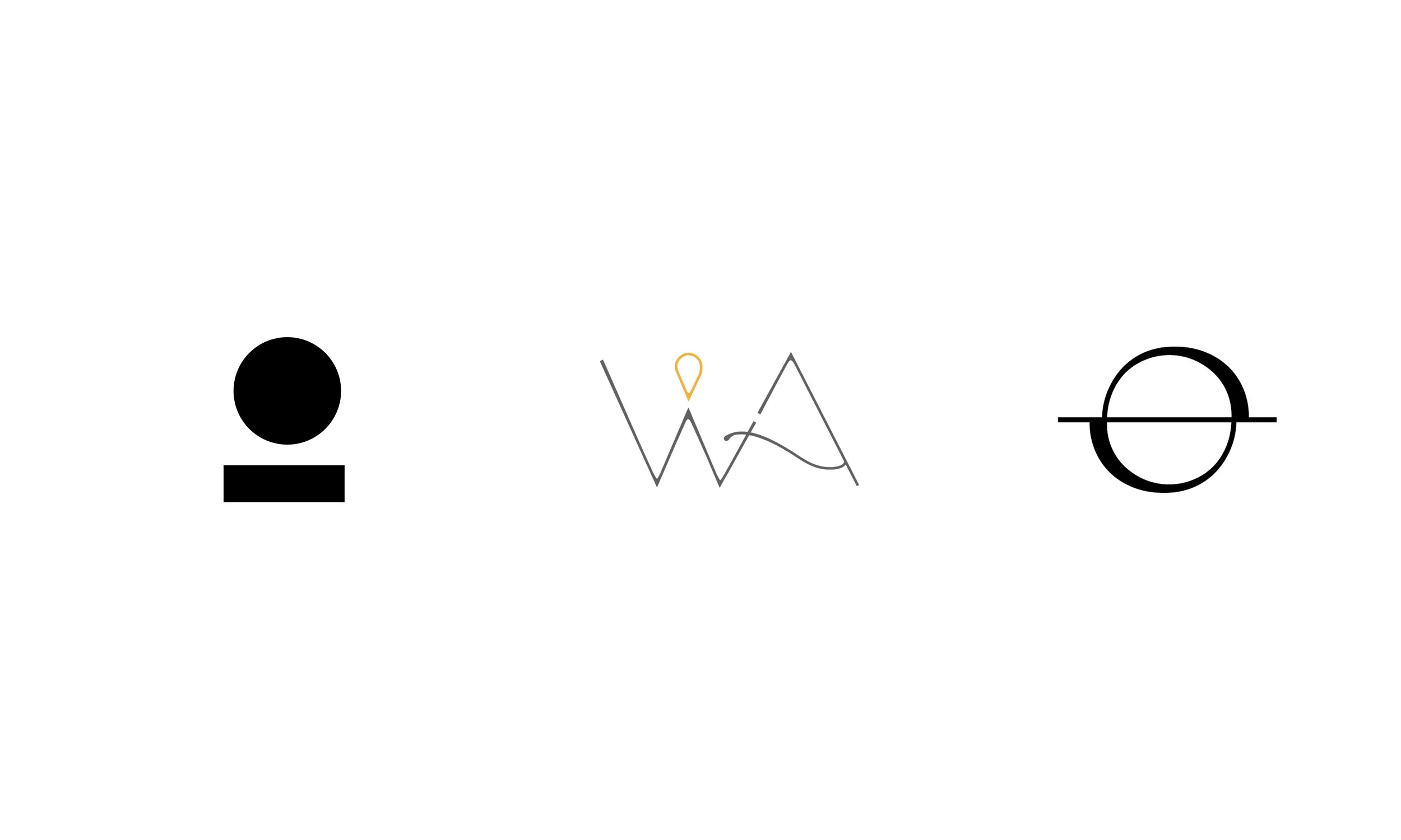
I began with sketching and vector exploration, and ultimately presented three distinct logo concepts. I completed the project to include a new logo, full visual identity system, brand book, and both digital and print mockups.
Sketching & Research
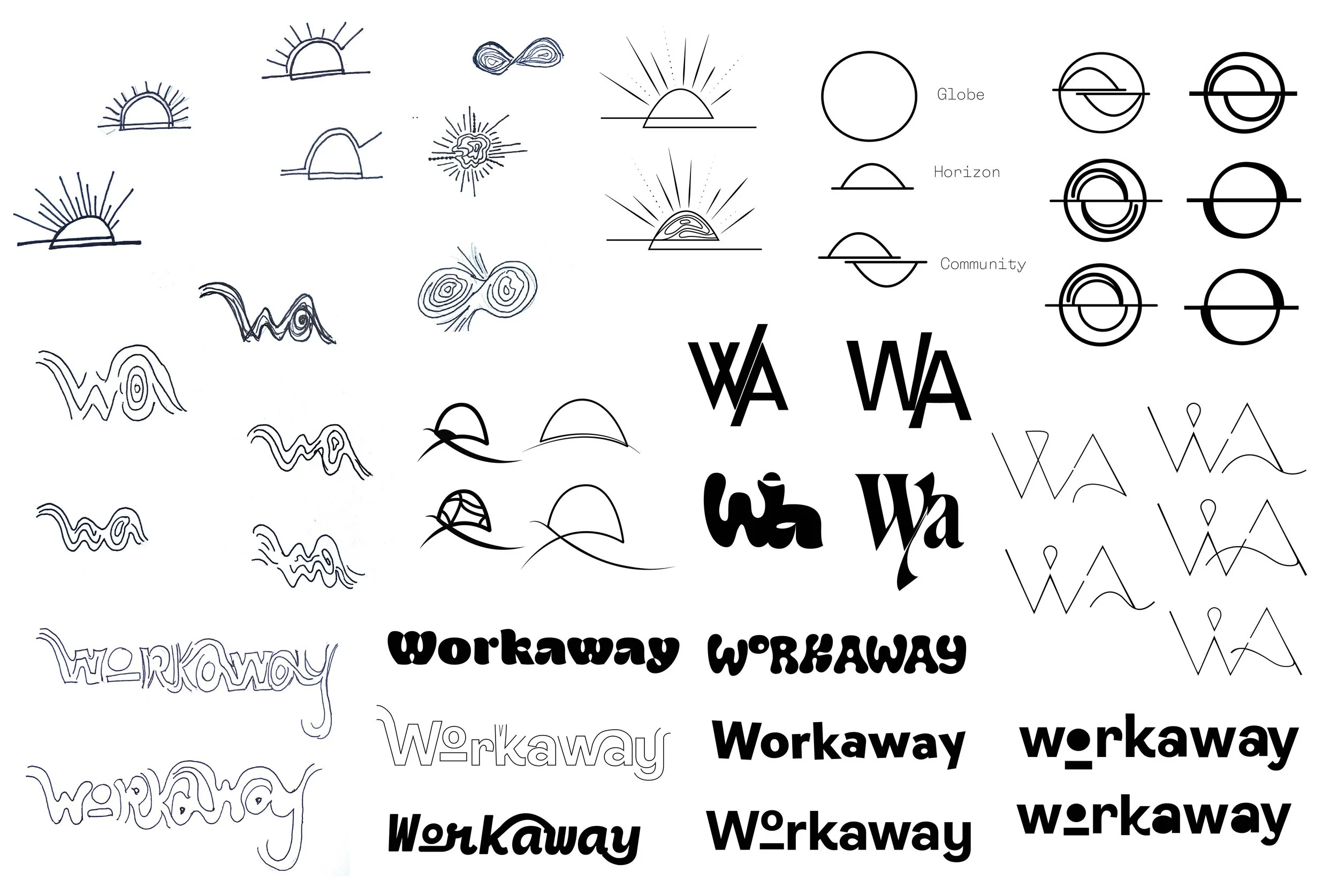
I began my research with understanding the existing Workaway brand - their current challenges, their competition, and how to make them stand out. I brainstormed a free-form word association list to first depict the essence of brand, and picked out the words that could come to life visually. Next, I began
free-hand sketching, bringing my most successful marks into the vector phase. Playing with refreshing their existing horizon mark, full wordmarks, and intricate symbols. After iteration and iteration, pulling and pushing my ideas, I can come up with three distinct concepts to present to the client.
The Logo Mark
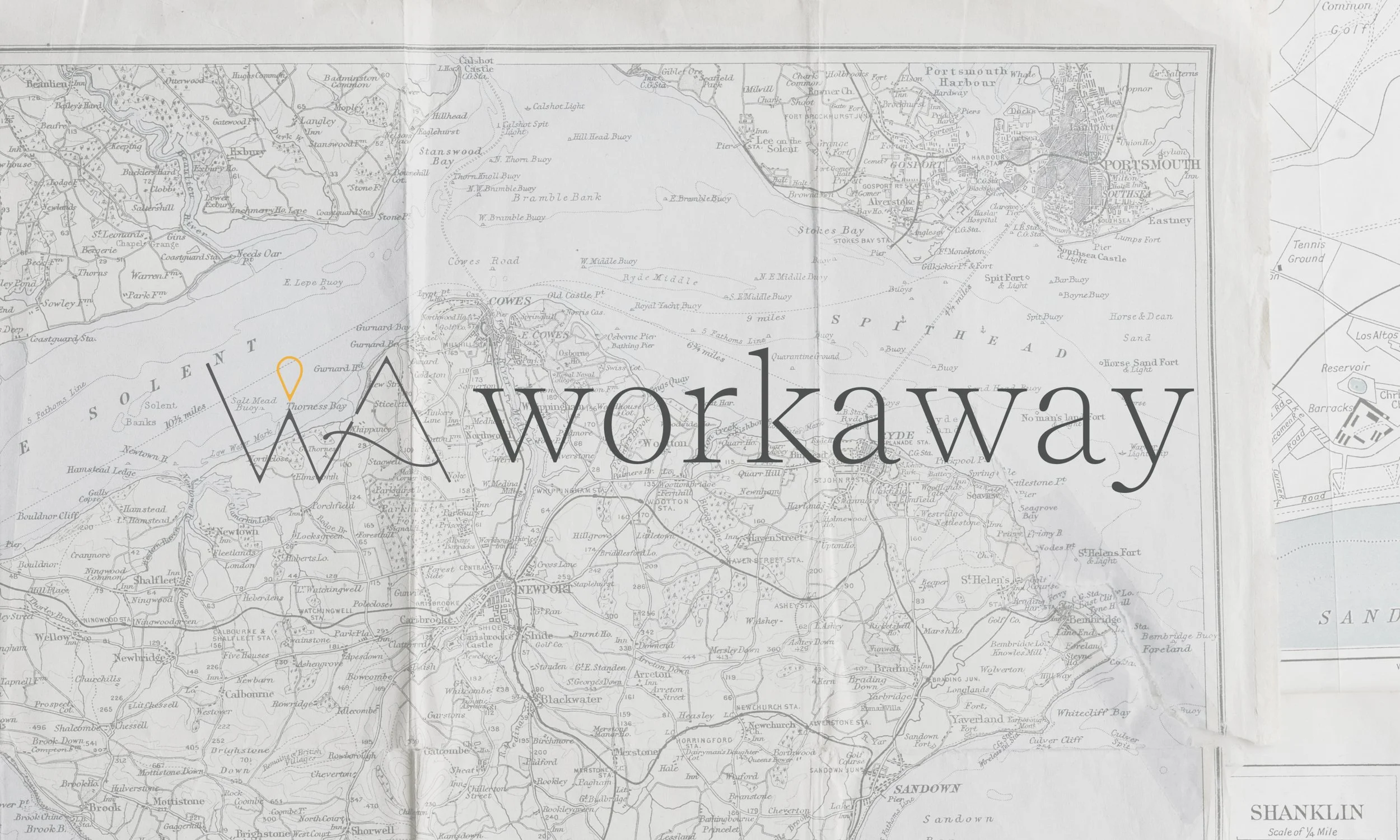
Out of the three options we presented, the client chose the concept “Finding Your Way”. Which is an elegant mark that feels light and ties us to communities we bond with. We use the W and A to create a typographic map within the symbol. Leading the viewers through peaks and valleys that they can visit. The stroke of the A is curved and softens the mark and makes it feel airy and open. We have the destination point in our bright yellow to be the guiding light of Workaway - knowing that they can trust us to be their guide.
